Brand Guidelines
Page updated: 20 October 2021
Foreword
From conception to reality, LTT has been passion and purpose-led for over 15 years. Ultimately, our brand is a reflection of our people, who infuse the company with energy and optimism, working to create opportunities for our students and partners.
Consequently, our brand has evolved to be a mix of the creative and professional, mixing flexibility with reliability, expertise with innovation. Through our palette of blues, laboratory-inspired logo, and visually undemanding design principles, we create brand cohesion and recognition.
This guide exists to illustrate how LTT's brand comes to life. Our branding is tied to our reputation - it helps to communicate our values, and reinforce what we stand for and how we operate. It has been an honour for me to serve and lead LTT; I am immensely proud of our brand and our people, and grateful for the unique contributions offered by every member of the team. My hope is that every LTT employee takes pride in our company and our brand as we continue to learn, adapt, and improve.
- Simon Gazia, CEO & Founder

Our mission is an action-oriented statement that defines the purpose we serve for stakeholders.
Our mission
To deliver real learning for our students, commercial value for our clients, and expert guidance for industry.

Our vision describes where LTT aspires to be upon achieving its mission.
Our vision
Industry best in laboratory and pathology collection training.

Our tagline is a short, memorable phrase that expresses the value of what we do.
Our tagline
Empowering people to perform.

Our unique selling proposition (USP) outlines our services in a way that differentiates LTT from competitors.
Our Unique Selling Proposition (USP)
LTT is the national leader in laboratory and pathology collection training. We set the standard in education quality, industry relevance and compliance. We support students to fulfill their career goals. For organisations, we are a trusted partner that adds value to workforce development objectives whilst supporting commercial outcomes.
Our communications
Every interaction with a stakeholder is a chance to elevate and protect LTT's brand - whether they are a current or prospective student, workplace supervisor, supplier, or colleague. Customer service is an essential part of our brand and we are taking action to further strengthen our capabilities in this area.
Our team:
Responds quickly - we aim for a 2 business day turnaround on all enquiries and applications for enrolment)
Wants to help - whether in person, on the phone, or via email, our team can be relied on to be polite, friendly, helpful, and always professional
Are human - we make use of templates and automation to enhance our communications, but person-to-person interaction remains at the heart of our commitment to customer service
Answer questions - we don't provide generic information in response to a specific query, our team address any questions raised and answer them thoroughly, thoughtfully, and accurately
Check the details - whether it's spelling, grammar, client details, or the relevancy of the message, our team triple check information before providing it to a stakeholder
Track interactions - we can't provide effective customer service if we don't know what's already been said, our team record their calls, emails, and face-to-face interactions with our stakeholders
Our marketing
POLICY
The purpose of LTT's marketing policy is to ensure our marketing is accurate, clear, and managed ethically and effectively, allowing students and clients to make an informed choice prior to enrolment. It covers the following main points:
LTT is solely responsible for all advertising, marketing and recruitment done on its behalf – regardless of the channel or method used.
LTT must honour all commitments made in its marketing.
LTT is subject to all relevant consumer protection law that applies in any jurisdiction where it operates.
LTT’s marketing must comply with the Australian Government’s Australian Skills and Quality Authority (ASQA) Standards for Registered Training Organisations (RTOs) 2015, including meeting the requirements stipulated in Clause 4.1.
LTT’s marketing must meet certain additional requirements as specified by the relevant regulatory authority for any applicable government funding program (including any acknowledgement of government funding as required under the specific training initiative).
LTT must comply with the Spam Act 2003.
LTT representatives who make unsolicited contact with potential students (i.e., where an enquiry has not been received from a prospective student – e.g., ‘cold calls’ made by the business development team) in order to sell them course services must comply with the Do Not Call Register Act 2006 and associated telemarketing standards, including the Telecommunications (Telemarketing and Research Calls) Industry Standard 2017.
Please refer to the full policy for details and ASQA's marketing fact sheet.
Process
Review or request | Updates of existing material are completed according to review dates recorded in the marketing register. Requests for new material or campaigns can be sent to marketing@ltt.edu.au.
Create & confirm | Draft material is reviewed in liaison with internal staff or third parties as required. Once finalised, a marketing check is completed online via surveymonkey.com/r/lttmarketingcheck to confirm compliance.
Record & release | The marketing register is updated when new or updated material is published or otherwise made available. The completed check is saved alongside a copy of the marketing material, the original request (if applicable), any evidence of consent (if applicable, e.g., for testimonials), and any other related information or evidence that may be relevant to an audit.
Audit | Quality conduct regular internal audits.
Communicate | Updates and statistics are shared via a quarterly company-wide report.
CAMPAIGN COMPONENTS
Our marketing falls into two main categories that reflect our services - 'B2C' (business to consumer) training for individuals, typically held in classroom-based and/or online settings; and 'B2B' (business to business) training for workplaces. Campaigns are predominantly electronic and typically involve some or all of the elements below. Additional print and/or online material may be produced to support certain campaigns.
Paid
Search engine marketing (SEM): Google Ads
Social media marketing: Facebook / Instagram Ads + LinkedIn, typically optimised for lead generation (vs. e.g., website conversions)
Organic
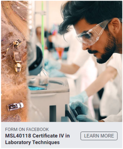
Course page: Via Squarespace, featuring flyer, online application & enquiry form
Email templates: Used for individual responses & electronic direct mail (EDM), shared via online enrolment portal + combined customer relationship management (CRM) & marketing automation software
Banners: Email signature blocks may reflect seasonal campaigns
Search engine optimisation (SEO): Managed in-house using white-hat (transparent & valid) strategies to improve organic search results, tracked via Google Analytics
Social channels: Activity scheduled using a third-party tool to share content regularly
Our colours
There are two ways to use colour in design: contrast and harmony. Contrast is based on difference, whereas harmony is based on likeness. Designs that use hues adjacent to each other on the colour wheel produce a pleasing harmony. Contrast is achieved by using complementary colours (opposites on the colour wheel) to produce striking, lively results.
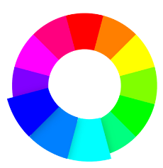
Colours from red through to yellow on the colour wheel are considered warm. They are frequently used to portray energy, excitement, boldness, or urgency. Cool colours are more subdued, ranging from blue to green and purple, and are used to create feelings of calm and security. Blue is the only primary cool colour, often used by technology, health care, and financial institutions to represent strength, quality, formality, serenity, safety, reliability, and expertise.

The shades of indigo dye, azure, and light cornflower blue used in LTT's branding convey a sense of sophistication, expertise, and reliability. Our dark blue is mature and professional, communicating intelligence and dependability; our light blue symbolises tranquility, openness, and possibility; while our bright blue is refreshing, friendly, welcoming, and energising. LTT green may be used to draw focus to an element.

Repetition of the colour blue strengthens brand association, and in turn brand awareness. Together, the LTT blues form an analogous tri-colour scheme: three colours that are side by side on the colour wheel. This combination is versatile, but can be overwhelming. To provide balance, two colours are used to accent a third, dominant colour. Where appropriate for a design, Marketing may occasionally make use of other colours.
Accessibility
We check contrast to ensure adherence with the Web Content Accessibility Guidelines (WCAG), which are a series of recommendations for making the web more accessible. Regarding colours, the standard defines two levels of contrast ratio: AA (minimum contrast) and AAA (enhanced contrast).The level AA requires a contrast ratio of at least 4.5:1 for normal text and 3:1 for large text (at least 18pt) or bold text. The level AAA requires a contrast ratio of at least 7:1 for normal text and 4.5:1 for large text or bold text.
Our typography
Aileron
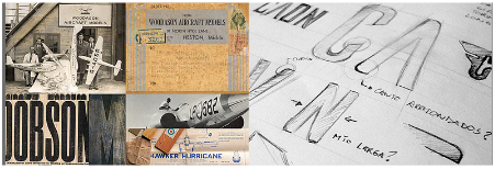
Designed by Sora Sagano, Aileron is a neo-grotesque sans-serif group of fonts inspired by aircraft models from the 1940s. Influenced by the design principles featured in Helvetica, and conceptually similar to Univers, Aileron has improved legibility and a softer appearance, thanks in part to the use of circular dots and periods that follow the Euler spiral. LTT use Aileron in most marketing materials.

Montserrat
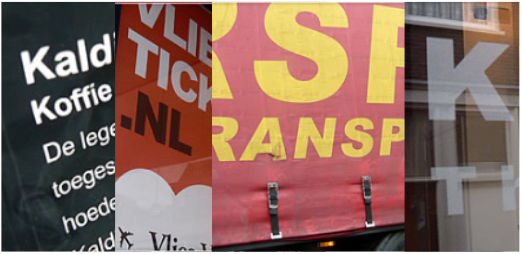
Montserrat, designed by Julieta Ulanovsky and backed on Kickstarter, is a geometric sans-serif typeface inspired by the urban typography featured in posters and signs in the traditional Montserrat neighborhood of Buenos Aires during the first half of the twentieth century. Montserrat is considered similar - but more distinctive - when compared to Gotham and Proxima Nova. LTT use Montserrat on our website.
Arial
This contemporary sans-serif font was designed in 1982 by Robin Nicholas and Patricia Saunders. Arial features softer and fuller curves compared to most industrial sans-serif typefaces, and terminal strokes cut on the diagonal to give a less mechanical appearance. Arial's versatility, readability, and availability has led to its popularity and success in a variety of text settings, including reports, advertising, books, logos, instructional manuals, web design, and more. LTT use Arial for several purposes, including resource design, internal communications, within our learning management system, and more. Body text should be in 11 point.
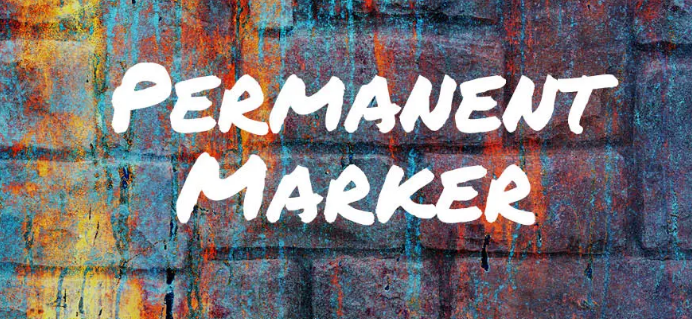
accent fonts
In certain designs, LTT will feature an accent font such as Permanent Marker (pictured), to pair with one of our primary typefaces and draw attention to a particular detail. Sans-serif fonts, like those used by LTT, convey simplicity, modernity, and minimalism. Sans-serif fonts are optimised for digital displays and, unlike serif fonts that feature fine details (e.g., Times New Roman), remain easy to read even at low resolutions. LTT's primary fonts have been selected due to their exceptional readability and accessibility.
Our name
Our marketing and corporate processes support two separate entities:
LTT Group Pty Ltd (RTO 51621)
Labtech Training Victoria Pty Ltd (RTO 22545)
Both organisations are referred to as LTT.
The abbreviation LTTV is occasionally used internally (to distinguish our Victorian company from the national arm of the business).
LTT is used as a collective reference where a communication concerns both RTOs.
Formal communications should always include the full legal name and RTO code of the relevant institution. These details often appear in the footer of a document or email. In written statements and agreements, it is helpful to use the complete legal name in the first instance, followed by the acronym "LTT" in brackets (subsequent references to the company can then be made to LTT, rather than the longer legal name). The RTO code must also be included.
e.g., LTT Group Pty Ltd (LTT), RTO 51621, in partnership with... Since 2005, LTT has...
e.g., Labtech Training Victoria Pty Ltd (LTT), RTO 22545, is pleased to present... LTT offers ...
Common naming errors to avoid
Labtech Training Pty Ltd (missing ‘Victoria’)
LTT Group (missing ‘Pty Ltd’)
LabTech Training Victoria Pty Ltd (the 't' in 'Labtech' should be in lowercase)
Leading Technical Training (an outdated tagline)
Our logo
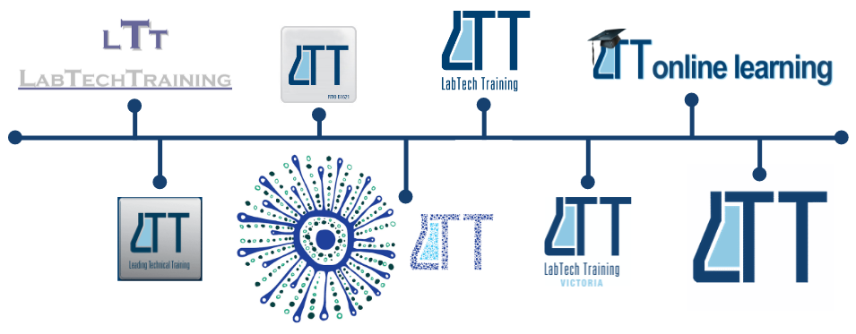
Over the years, the LTT logo has enjoyed many iterations.
Both LTT Group Pty Ltd (RTO 51621) and Labtech Training Victoria Pty Ltd (RTO 22545) use the same logo.
Primary
Where possible, the original light and dark blue logo must be used.
Dark backgrounds
On dark backgrounds, a one-colour (white) logo may be used.
Moderate backgrounds
Where the detail of the logo would be lost using the primary or white logo, a two-colour variation may be used, with the flask feature shown in white instead of light blue.
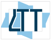
For graduates
Upon successful completion of an LTT qualification, students automatically receive a copy of our graduate badge (pictured), along with instructions to display their digital credential.
Our graduate logo is differentiated from our main branding with the inclusion of a graduated conical flask design.

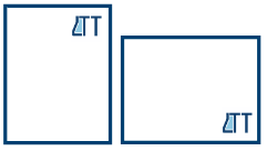
clear space
Make sure the logo can breathe by reserving clear space equal to the height of the “flask” on all sides.
placement
The logo must appear on the front of all promotional material, and in most cases all internal and external documents. In a vertical layout, our logo is best in the upper-right corner. In a horizontal layout, place the logo in the lower-right corner — or centre it if the layout is narrow.
sizing
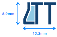
Our logo must be reproduced at a legible size appropriate to the design, without distorting the logo’s proportions when resizing. In digital applications, our logo should be at least 100 pixels wide. Unless appearing in a footer of a document, in print, it should be at least 13.2mm wide. Where possible use the Adobe Illustrator file (.eps), otherwise the transparent PNG file. The logo should not exceed 20% of the space where it is applied.

Do not use the white logo on light backgrounds.

Do not use effects on the logo.

Do not stretch the logo.

Do not rotate the logo.
Do not use the primary logo on dark or busy backgrounds.
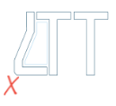
Do not outline the logo.

Do not change the logo colours.

Do not use the logo in a sentence.
Nationally Recognised Training (NRT)
The NRT logo is a distinguishable mark of quality for promoting and certifying national vocational education and training leading to Australian Qualifications Framework (AQF) qualifications or Statements of Attainment. Use of the NRT logo is only permitted where there is a direct relationship to an accredited AQF aligned course, Training Package qualification or a course meeting the requirements of the AQTF. View guidelines here.
Real skills for real careers (RSfrc)
Where space allows (and appropriate to the design), we use the RSFRC logo on marketing collateral designed for our B2C (non-workplace) audience. The logo is made available by the Australian Government's Department of Education and Training and is designed to highlight the VET sector's close ties with industry and outstanding employment prospects, aiming to position VET as a first choice study option. The RSFRC logo is available in six colours in addition to black and white. We typically use the RSFRC logo in blue to maintain consistency with LTT's colour scheme. The RSFRC logo is used in compliance with the style guide.
Funding logos
Hierarchy of visual elements specified by government funding authorities always overrule LTT's guidelines.
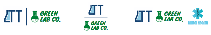
partnerships
When we partner with a third party, we may use a co-branded logo. It’s made up of three elements, arranged from left to right: the LTT logo, a dividing line in brand colours, and the third-party logo. The logos should appear equal in size. Where multiple supporting logos are used, the dividing line is not required.
Our imagery
Photographs
LTT's marketing features stock images from time to time, however we prefer to use original, high resolution photographs wherever possible. Staff are encouraged to take photos in the classroom and out at workplaces for marketing use. Follow the following tips to create high quality photos:

Always ask permission before taking someone's photo (students provide marketing consent within their enrolment paperwork, however this can be withdrawn at any time - and it's always polite to ask!) Any requests for removal will be actioned immediately by the marketing team.
Seek written confirmation from a client to share photos taken on their premises, or featuring their staff, and forward to marketing@ltt.edu.au along with the images.
Ensure any photos show appropriate personal protective equipment (PPE) being used - this varies depending on region, but at a minimum, participants in laboratory and clinical settings should be photographed wearing gloves .
Double check the background of the photo to make sure it is tidy and free of sensitive material and anyone not relevant to the composition of the photo.
ICONS
In classic LTT blues, our icons and symbols are mixed and matched to strike a balance between playful and professional. Often used to communicate context in place of wordy explanations or simply to make a design more dynamic, you might see them placed in email signatures, printed stationery, campaign headers, pamphlets, and more.
Illustrations
Occasionally used for specific campaigns and internal communications, illustrations are used to enhance a friendly tone, tell a story, and add visual interest to a design.

GRAPHIC DEVICES
The timeless laboratory reference contained in the negative space of LTT's logo is frequently repeated to strengthen brand recognition and define a design. The element is used independently, in a range of opacities, and various gradients featuring LTT blues. You might spot the flask used to border pages or mask relevant images - it may appear rotated or flipped in any orientation except down - a symbolic spill!